Layering Paint for Depth and Interest
This weekend I’m teaching my “How Do I Use This?” Meets the Art Journal Page class. Most of the first day is taken up with creating the backgrounds on pages we will bind into a custom art journal, and one of the first points I emphasize is the need to work in layers in order to create depth, texture and visual interest.
The same concept is utilized in my A View to My Heart class (coming again this September), and I realized I hadn’t yet shared photos of the most recent session.
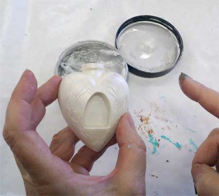
The focal point of this class are the Relics & Artifacts matte resin castings designed by the talented Sandra Evertson. (FYI, we’re awaiting a shipment of new designs of this gorgeous line: if you aren’t already receiving our weekly enewsletter, subscribe so you will get first notice of their arrival!)
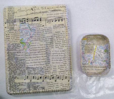
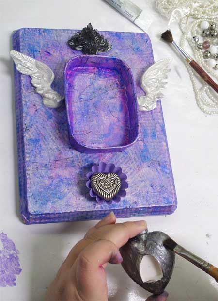
One way to ensure a layered look with depth is to begin with a collaged background. In the example above, found papers such as book text, map pages, sheet music and more are torn and added to a wooden base with matte medium.

While we used a variety of paint in this class, everyone loved using the Silks Acrylic Glazes. These smooth paints contain mica for iridescence and are available in a wide variety of colors.
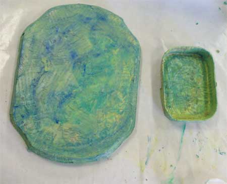
Because the Silks are translucent, our collaged backgrounds peek through. Silks layer beautifully with extra coats; one of their selling points is that you never get “mud” when painting one color atop another, even if they are opposites.
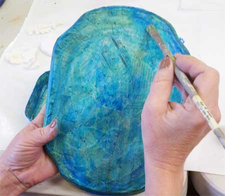
We added complementary and contrasting colors to add another layer and visual interest.
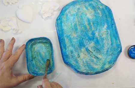
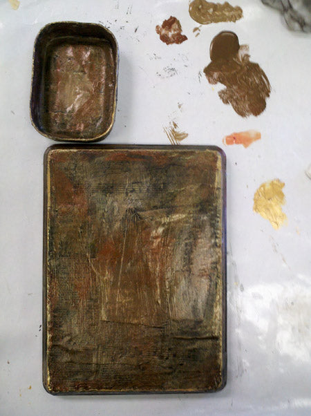
Several chose to add metallic color for highlights and to lighten dark colors.
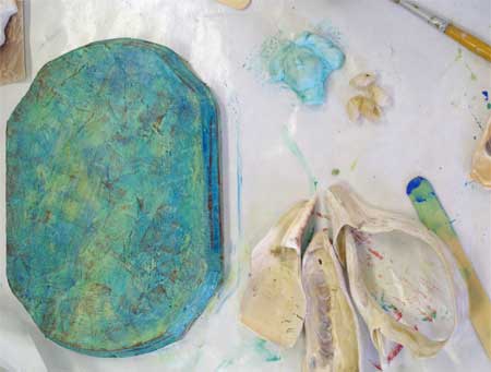
One of the wood plaques available had the ‘flaw’ of a large, dark knotty grain running along the edge (below photo). This student made it a part of her design, to great effect!
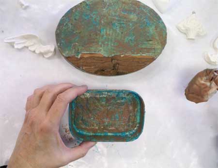
The Relics and Artifacts pieces take paint beautifully. No matter what color theme the students chose to work with, the results were gorgeous!
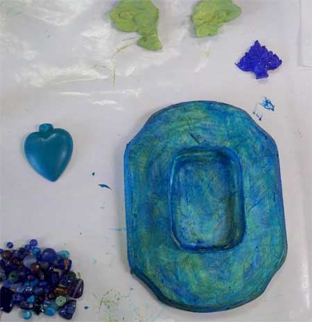
To add metallic color or to highlight edges and design elements, we also used Inka Gold metallic rubs. Don’t let the name fool you: these are available in more than 20 colors!
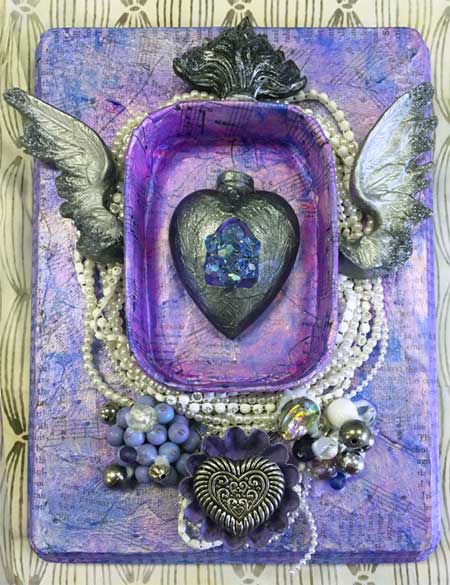
After starting with a blue base layer (seen in the second photo of this post), my student Kelsey Grandy worked her way up to beautiful purple/violet tones by layering and blending her colors (photo below).
Adding layers continues right to the end of a project. Below, my student Joan Grandy wanted to use the rusted, flattened bottle cap (a sentimental object) in her shrine, but was going to leave it out as she thought it didn’t fit with the color scheme. I taught her that by adding the complement of blue, orange, in the form of a rust effect the balance she wanted would be achieved... and it would distress her elegant assemblage a bit so that the look of the cap wouldn’t be out of place. We made the rust even more authentic by using Rusty for Paper by Viva.
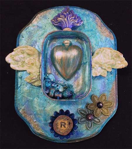
More finished student work. All different, and all wonderful!
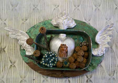
The below steampunk-inspired art is by Sharon McDonagh, who had left room for the stamped inscription and added more embellishments at home after the class.
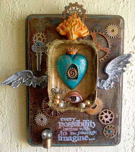
Below, Kelsey Grandy’s finished art.
As noted, I’m going to be teaching A View to My Heart again on September 10 so I hope some of you can join me!



Leave a comment